
Product changes are easiest to understand when the update tells users three things fast: what changed, why it matters, and what to do next. That sounds simple, but many teams still ship vague notes like “performance improvements,” then wonder why support gets flooded. Pendo has reported that up to 80% of product features are rarely or never used, which makes clear update communication more than a nice extra [source: Pendo].
TLDR: A good app update does not just announce a change. It shows the user how their daily work will be different. For example, if a billing app moves “Download invoice” from the top menu to a new “Documents” tab, the update should show the old path and the new path. In one support scenario, that kind of message could cut repeat “Where did it go?” tickets by 20% to 30% during the first week.
1. The “Before and After” Update
This is one of the clearest formats for product changes. It works because users often care less about the feature name and more about what moved. Honestly, it feels like some apps forget people build habits around buttons, menus, and shortcuts.
A good before and after update might say:
- Before: Reports were under Analytics > Monthly.
- Now: Reports live under Insights > Reports.
- Why: All saved reports, dashboards, and exports now sit in one place.
This format is perfect for layout changes, menu updates, renamed features, and dashboard redesigns. The key is to use plain labels. Do not say “We improved the reporting experience.” Say exactly what changed.
Best use: major interface changes that may confuse regular users.
Simple example copy: “We moved saved reports into Insights. Your reports are still there. Go to Insights > Reports to open, edit, or export them.”
2. The Short In App Walkthrough
Some changes need more than a release note. If users need to click, choose, or set something up, use a short in app walkthrough. Keep it tight. Three steps is great. Five is usually the limit.
The worst version of this is a full screen tour with ten popups. Nobody wants that. Expect people to skip it if it blocks their work for more than a few seconds.
A better walkthrough might look like this:
- Step 1: “Your project filters are now here.”
- Step 2: “Save a filter to reuse it later.”
- Step 3: “Share filtered views with your team.”
This update style works well for tools with many settings, such as project management apps, CRMs, finance tools, and design platforms. It lets people learn by doing. That matters because a feature shown in context is easier to remember than a feature described in a long email.
Best use: new workflows, new settings, or changes that need user action.
Simple example copy: “Your saved filters have a new home. Take a 30 second tour, or skip it and open Filters from the left menu anytime.”
3. The Segmented Changelog
A changelog can be useful, but only if it is sorted for humans. One giant list of fixes is not helpful. It drives me crazy when an app lists 18 updates with no clue which ones affect admins, free users, or mobile users.
A segmented changelog fixes that. Split updates by audience or task.
- For admins: New permission controls for private folders.
- For managers: Weekly team summaries now include overdue tasks.
- For mobile users: Uploads now continue in the background.
- Bug fixes: Fixed a timezone issue in calendar exports.
This style respects the user’s time. People can scan the section that applies to them and ignore the rest. It is especially useful for apps with several user roles.
You can also add labels like New, Improved, Fixed, and Action needed. The label Action needed is the most useful one. It tells users they should not just skim and move on.
Best use: weekly or monthly release notes with several changes.
Simple example copy: “Admins: Review the new sharing controls before Friday. Existing folder access will stay the same unless you change it.”
4. The “Why We Changed It” Message
Users get annoyed when software changes without a reason. Even a two sentence explanation can reduce that friction. You do not need a long backstory. Just explain the user benefit.
For example, instead of:
“We updated the checkout flow.”
Say:
“Checkout now has fewer steps. Most customers can complete payment in two screens instead of four.”
That is clearer. It also answers the silent question users often have: “Why did you mess with this?”
This update type is great when a change may feel uncomfortable at first. Maybe the app removed a tab. Maybe a button moved. Maybe a familiar setting has a new name. Give the reason before frustration builds.
Best use: redesigns, removed features, renamed tools, or changed workflows.
Simple example copy: “We combined Tasks and Reminders into one list. You can now see every follow up in one place, without switching tabs.”
What Strong App Updates Have in Common
The best app update messages are short, specific, and timed well. They do not force users to hunt for meaning. They also match the size of the change.
- Small fix: Use a short changelog line.
- Moved feature: Use a before and after note.
- New workflow: Use a short walkthrough.
- Big redesign: Use screenshots, labels, and a clear reason.
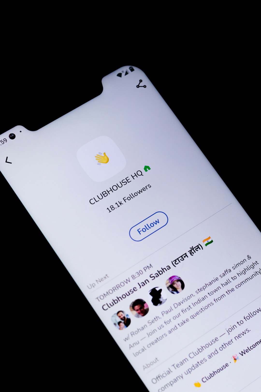
Try to include one visual when the change affects layout. A screenshot with a highlighted button can save users from guessing. It can also save your team from answering the same question 200 times.
Quick Template You Can Reuse
Here is a simple structure for almost any product update:
- What changed: “Saved views are now called Custom Views.”
- Where to find it: “Open Views from the top right of your dashboard.”
- Why it changed: “This name better matches how teams use it.”
- What to do next: “No action is needed. Your saved views were moved automatically.”
Clear updates reduce confusion. They also build trust. When people understand what changed, they are far more likely to try the new version instead of fighting it.