
A product landing page is like a friendly salesperson who never sleeps. It welcomes visitors, explains the offer, answers doubts, and nudges people to click. When it works well, sales go up. When it does not, visitors leave faster than a cat near bath water.
TLDR: A great product landing page is clear, fast, and focused on one main action. Show the product, explain the benefit, and make the next step easy. Use strong headlines, simple copy, trust signals, great visuals, and a bold call to action. Test often, because tiny changes can bring big wins.
Start With One Clear Goal
Every landing page needs a mission. Not five missions. Not a confusing buffet of buttons. One goal.
Do you want people to buy? Start a free trial? Book a demo? Join a waitlist? Pick one. Then build the whole page around that action.
If your page has too many choices, visitors freeze. This is called decision fatigue. It is the same feeling you get when a menu has 87 sandwich options. Nobody needs that stress.
- Good: “Start your free trial.”
- Better: “Start your free trial in 60 seconds.”
- Not great: “Learn more, contact us, read our blog, follow us, download this, watch that.”
Keep the path simple. One page. One promise. One button.
Write a Headline That Does the Heavy Lifting
Your headline is the first big moment. It should tell people what the product does and why they should care. Be clear before you get clever.
A cute headline can be fun. But if people do not understand it, it fails. Your visitor should know the value in about three seconds.
Use this simple formula:
- Get benefit without pain point.
- Do task faster, easier, or better.
- Product type for specific audience.
For example, “Create professional invoices in minutes” is clear. “Make money paperwork less annoying” is fun, but less direct. You can use both. Put the clear message first. Add personality below it.
Simple wins. Confused visitors do not convert.
Show the Product Early
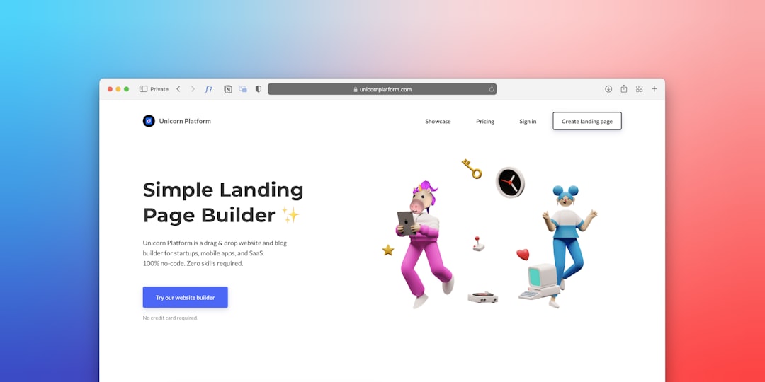
People want to see what they are buying. Do not hide the product like it is a secret treasure map. Show it above the fold if you can.
Use sharp images, product screenshots, short videos, or simple animations. If your product is physical, show it in use. If it is software, show the interface. If it is a service, show the result.
Good visuals answer questions fast. They also make the product feel real. This builds trust.
Try these ideas:
- Show the product from different angles.
- Use a short demo video under 90 seconds.
- Show before and after results.
- Add captions to explain key features.
- Use real photos when possible.
Avoid generic stock images when they say nothing. A smiling person with a laptop is not proof. It is just a person with excellent teeth.
Focus on Benefits, Not Just Features
Features tell what your product has. Benefits tell why that matters. Benefits sell.
Feature: “Cloud storage.” Benefit: “Access your files from anywhere.”
Feature: “Automated reports.” Benefit: “Save three hours every week.”
Feature: “Water resistant fabric.” Benefit: “Stay dry when the weather gets dramatic.”
Your visitors are always asking one silent question: “What is in it for me?” Answer that question often.
A helpful structure is:
- Problem: What is frustrating right now?
- Solution: How does your product fix it?
- Outcome: What gets better after purchase?
Use plain language. Skip fancy words that make people work too hard. The goal is not to sound smart. The goal is to be understood.
Create a Call to Action That Pops
Your call to action, or CTA, is the button people click. It should be easy to find. It should look clickable. It should use action words.
Bad CTA: “Submit.”
Better CTA: “Get my free trial.”
Great CTA: “Start saving time today.”
Make your button stand out with contrast. Use enough white space around it. Repeat it in helpful places, especially after major sections. But do not turn the page into a button zoo.
CTA copy should match the visitor’s desire. If they want speed, mention speed. If they want savings, mention savings. If they want confidence, mention ease.
Bonus tip: Add a small line near the button to reduce fear. Try “No credit card needed” or “Cancel anytime.” Tiny words can calm big doubts.
Build Trust Like a Pro
People do not buy from pages they do not trust. Trust is not optional. It is the bridge between interest and action.
Add trust signals throughout the page. These little proof points say, “Hey, we are real. People like us. You are safe here.”
Useful trust signals include:
- Customer reviews and testimonials.
- Star ratings.
- Case study results.
- Logos of known customers or partners.
- Secure payment badges.
- Money back guarantees.
- Clear contact details.
Testimonials work best when they are specific. “Great product!” is nice, but weak. “We increased signups by 32% in two months” is much stronger.
Remove Friction Everywhere
Friction is anything that slows people down. Long forms. Confusing prices. Slow pages. Hidden shipping costs. Tiny text. Weird navigation. All of it hurts conversions.
Your landing page should feel smooth. Like sliding down a clean playground slide. Not like assembling furniture with missing screws.
To reduce friction:
- Ask for fewer form fields.
- Make pricing simple.
- Explain shipping, returns, or billing clearly.
- Use large, readable text.
- Make the page load fast.
- Check that it works well on mobile.
Mobile matters a lot. Many buyers browse on phones. If your button is tiny or your page loads slowly, they will leave. Their thumb has no patience.
Answer Objections Before They Stop the Sale
Visitors have doubts. That is normal. Your job is to answer those doubts before they become exits.
Common objections include:
- “Is this worth the price?”
- “Will it work for me?”
- “Is it hard to use?”
- “Can I cancel?”
- “What if I do not like it?”
Add a short FAQ section near the bottom. Keep answers clear. Do not bury important details in legal fog.
If your product has a guarantee, show it. If setup is easy, say so. If support is included, mention it. Give people fewer reasons to hesitate.
Use Layout to Guide the Eye
A strong landing page has a visual path. Visitors should not wonder where to look next. The page should guide them like a helpful museum tour guide.
Use headings, spacing, icons, and sections. Break large blocks of text into smaller chunks. Short sentences help. So do bullets. Your page should be easy to scan.
A simple landing page flow might look like this:
- Hero section with headline, product image, and CTA.
- Short benefit statement.
- Key features with clear benefits.
- Social proof.
- How it works.
- Pricing or offer details.
- FAQ.
- Final CTA.
This structure feels natural. It tells a story. First, hook attention. Then explain value. Then prove it. Then ask for action.
Make the Offer Feel Urgent, But Honest
Urgency can increase conversions. But fake urgency is gross. Do not say “Only 2 left” if you have a warehouse full of them. People can smell fake scarcity.
Use real urgency instead:
- Limited time launch pricing.
- Seasonal discounts.
- Bonus items for early buyers.
- Enrollment deadlines.
- Low stock alerts when true.
Urgency gives people a reason to act now. Honesty gives them a reason to trust you later.
Test, Learn, and Improve
No landing page is perfect forever. Even great pages can get better. Testing helps you find what works with real visitors, not guesses.
Try testing one thing at a time:
- Headline wording.
- CTA button text.
- Hero image.
- Form length.
- Pricing layout.
- Testimonials.
Watch the numbers. Look at conversion rate, bounce rate, scroll depth, and clicks. Also watch user behavior recordings if you have them. They can show where people get stuck.
Small changes can create big results. A clearer headline. A shorter form. A better button. These things add up.
Final Thoughts
A high converting product landing page is not magic. It is clarity, trust, speed, and focus. Make the page easy to understand. Show the product. Explain the benefit. Remove doubt. Ask for the click.
Think of your landing page as a helpful guide, not a pushy salesperson. When visitors feel understood, they stay longer. When they trust the offer, they take action. And when the page makes buying easy, sales have a much better chance to dance all the way to the checkout.