Use Figma when the screenshot is part of a product workflow, design review, or UI documentation; use Canva when the goal is a polished marketing image made fast. Figma gives you better control over spacing, overlays, component callouts, and pixel-level edits. Canva is easier for quick social posts, presentation slides, and simple annotations, but it can feel limiting once the screenshot needs precise UI treatment.
TLDR: If a product manager needs to mark three bugs on a mobile checkout screen before a sprint review, Figma is the safer choice because comments, frames, grids, and version history keep the work clean. If a marketer needs five app screenshots for LinkedIn in under 30 minutes, Canva will usually be faster. In a small team workflow, Figma may save 15–25% review time because designers and developers can discuss exact UI elements in one shared file. Canva wins when the edit is mostly cropping, adding text, placing the screenshot in a mockup, and exporting.
Best Use Case: Figma vs Canva at a Glance
Editing a UI screenshot sounds simple. Crop it. Add arrows. Blur private data. Export. Then the real problems appear: text alignment is off, spacing looks sloppy, the export is soft, or the annotation covers the button everyone is trying to discuss. This is where the difference between Figma and Canva becomes clear.
Figma is made for interface work. It treats a screenshot like part of a design system. You can place it inside frames, align it to grids, add precise callouts, and keep everything editable. Canva is made for visual content. It helps turn a screenshot into something presentable without much setup.
When Figma Is Better for Screenshot Editing
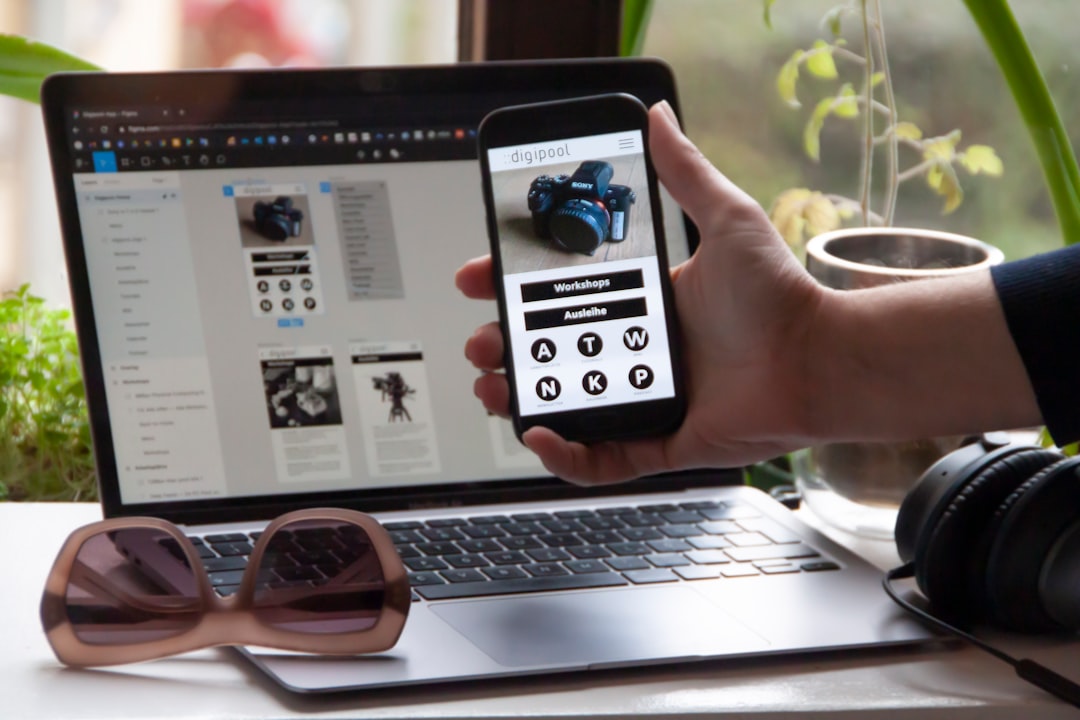
Figma is the better tool when accuracy matters. If you are editing screenshots of dashboards, mobile apps, SaaS screens, or onboarding flows, Figma gives you more control than Canva.
Common UI screenshot tasks that fit Figma well include:
- Adding precise annotations to buttons, menus, forms, and error states.
- Blurring or covering sensitive data with reusable shapes and masks.
- Comparing before and after screens inside aligned frames.
- Creating product documentation visuals for engineers, QA teams, and customer support.
- Building reusable screenshot templates for release notes or help articles.
Figma’s biggest strength is structure. You can create frames for desktop, tablet, and mobile screenshots. You can lock the screenshot layer and place labels above it. You can group annotations and reuse them across many screens. This matters when you need consistency across 20 or 50 screenshots.
The collaboration tools are also stronger for product teams. A developer can comment directly on a broken UI area. A designer can respond with a fixed version. A product manager can compare states without downloading five separate files. That cuts down on the messy “which screenshot are we talking about?” problem.
Honestly, it feels like Canva starts fighting back when you need exact spacing or repeated annotation styles. Figma is not perfect, but it behaves more like a workspace for serious UI review.
Where Figma Falls Short
Figma has a learning curve. A first-time user may spend 10 minutes figuring out frames, layers, exports, and masks before making a simple edit. That is not ideal if the task is only to add a red arrow and send a screenshot to a client.
It can also be too much for casual work. If your screenshot is going into a simple Instagram post, client update, or sales deck, Figma may feel heavy. Templates exist, but Canva still handles quick presentation-style layouts with less friction.
Another issue is file hygiene. Figma files can become messy fast. If nobody names layers or frames, a screenshot archive can turn into a pile of “Frame 49” and “Rectangle 138.” That drives me crazy during reviews, especially when one small label needs to be changed across multiple versions.
When Canva Is Better for Screenshot Editing
Canva is best when speed and presentation matter more than exact UI precision. It is useful for marketing teams, founders, educators, and support teams that need clear visuals without opening a full design workflow.
Canva works well for:
- Social media posts showing app screens or feature updates.
- Presentation slides with screenshots and short labels.
- Simple tutorials with arrows, circles, and text boxes.
- Mockup-style visuals using laptops, phones, or browser frames.
- Fast branding with colors, logos, and typography presets.
Canva’s template library is a real advantage. You can drop a screenshot into a phone mockup, add a headline, apply brand colors, and export in a few minutes. For teams that post product updates often, this speed is useful.

The interface is also friendlier for non-designers. Most people can understand it quickly. Drag, drop, resize, export. There is less pressure to understand layers, components, constraints, or frame hierarchies.
Where Canva Falls Short
Canva is weaker for serious UI analysis. Fine alignment is harder. Managing many screenshot states is clumsier. Collaboration is fine for basic feedback, but it is not as useful as Figma for marking exact interface problems.
Export control can also be less predictable. Screenshots may lose sharpness if they are resized too much or exported in the wrong format. For marketing graphics, that may be acceptable. For product documentation, blurry UI text hurts trust.
Canva’s annotations also look generic unless you spend time tuning them. Arrows, badges, and labels can feel more like a sales graphic than a product review. That is fine for a launch post. It is less ideal for a bug report or UX audit.
Practical Editing Workflow in Figma
For UI screenshot editing in Figma, use a simple and repeatable process:
- Create a frame that matches your output size, such as 1440 × 900 or 1920 × 1080.
- Place the screenshot inside the frame and lock the layer.
- Add annotations using consistent colors, labels, and arrows.
- Blur or mask private data with rectangles or effects.
- Group related notes so they can be moved or hidden quickly.
- Export as PNG for sharp UI detail.
This workflow is useful for bug reports, design QA, usability findings, and internal product reviews. If the same format will be used again, save it as a template. That small step can save hours over a month.
Practical Editing Workflow in Canva
For Canva, keep the process simple:
- Choose the final format, such as a slide, LinkedIn post, or help center image.
- Upload the screenshot and crop it to the key area.
- Add a device frame or browser mockup if the image is for promotion.
- Use short labels instead of dense notes.
- Apply brand colors for a cleaner public-facing result.
- Export at high quality, preferably PNG when text clarity matters.
Canva is strongest when the screenshot needs to look polished for people outside the product team. Keep it light. If the screenshot starts needing technical review, move the work to Figma.
Which Tool Should You Choose?
Pick Figma if the screenshot is tied to product decisions. That includes UI audits, bug reports, feature reviews, design handoff, QA notes, and changelog visuals. The extra setup pays off through cleaner files, better comments, and more accurate edits.
Pick Canva if the screenshot is tied to communication. That includes social posts, pitch decks, newsletters, blog images, and lightweight tutorials. It helps non-designers create clean visuals quickly.
A good rule is this: Figma is for accuracy; Canva is for speed. If you need both, edit the screenshot in Figma first, then bring the final image into Canva for layout and branding. That mixed workflow works well for many teams.
Final Verdict
For UI screenshot editing, Figma is the more capable and reliable tool. It handles precision, collaboration, and repeatable annotation systems better. Canva is still valuable, but mainly for fast, attractive presentation work.
If your screenshot will influence a product decision, use Figma. If it only needs to look good in a post or slide, use Canva. The right choice depends less on the screenshot itself and more on what the screenshot must accomplish.