

The best way to convert a Word file into a fillable PDF form is to clean up the Word layout first, export it as a PDF, then add and align form fields in a PDF editor. Do not rely on automatic field detection without checking every box, label, tab order, and signature area. That is how you get a form that looks polished instead of patched together.
TLDR: Start with a well-structured Word document, convert it to PDF, then place text fields, checkboxes, dropdowns, date fields, and signature blocks manually for best results. Automatic tools can save time, but they often misread lines, tables, and labels. For example, a 4-page employee onboarding form with 42 fields may take 20 minutes to prepare manually, but it can reduce follow-up correction emails by 30% to 40% if fields are aligned, named clearly, and marked as required where needed.
Why Field Placement Matters More Than the Conversion
Converting the file is the easy part. Making the form pleasant to complete is where the real work sits.
A fillable PDF should guide the user. The eye should move from field to field without confusion. Labels should sit close to their fields. Signature boxes should have enough room. Required fields should be obvious. If users have to guess where to type, your form has already failed.
Honestly, it feels like some form tools assume every blank line in a Word document is a field. They spot a row of underscores and slap a text box over it. Then you spend five extra minutes deleting weirdly placed fields from the footer. Annoying, but fixable.

Step 1: Prepare the Word Document Before Exporting
Open your Word file and clean it up before you touch any PDF tool. A messy Word file becomes a messy PDF. PDF editors can help, but they are not magic.
Use these checks before exporting:
- Use tables for structure: Tables keep labels and fields aligned better than floating text boxes.
- Remove extra spaces: Use tabs, tables, or paragraph settings instead of tapping the spacebar twenty times.
- Keep labels close: Place “Full Name” directly beside or above the area where the user will type.
- Leave enough field space: Names, addresses, and job titles need more width than you think.
- Use consistent fonts: Stick with simple choices such as Arial, Calibri, or Times New Roman.
- Check page breaks: Do not let a section title sit at the bottom of one page while its fields start on the next.
If the form will be printed as well as filled on screen, keep the blank lines visible. If it will only be digital, you can use clean boxes or shaded areas instead.
Step 2: Export the Word File as a PDF
Once the Word file is tidy, export it as a PDF. In Microsoft Word, go to File > Save As or File > Export, then choose PDF. Use the standard quality option unless the form contains high-resolution images or detailed graphics.
Before moving on, open the PDF and review it like a user would. Look for broken line spacing, shifted tables, missing icons, or awkward page breaks. It drives me crazy that a file can look perfect in Word and still shift slightly after export, especially when custom fonts are involved. If that happens, embed fonts if your software allows it, or switch to a safer font.
Step 3: Add Fillable Fields in a PDF Editor
Now open the PDF in a tool that supports form editing. Common options include Adobe Acrobat Pro, Foxit PDF Editor, Nitro PDF, PDFescape, and other business PDF editors. Some tools include automatic form recognition. You can try it, but treat the result as a first draft.
Add the right field type for each question:
- Text fields: Use for names, addresses, phone numbers, ID numbers, and short answers.
- Multiline text fields: Use for comments, explanations, or descriptions.
- Checkboxes: Use when users can select more than one option.
- Radio buttons: Use when users must select only one option from a group.
- Dropdown menus: Use for fixed choices such as department, state, country, or status.
- Date fields: Use for birth dates, appointment dates, and approval dates.
- Signature fields: Use where consent, approval, or authorization is required.
Name each field clearly. Instead of “Text1” or “Field23,” use names such as applicant full name, start date, or manager approval signature. Clear field names make data export easier later.
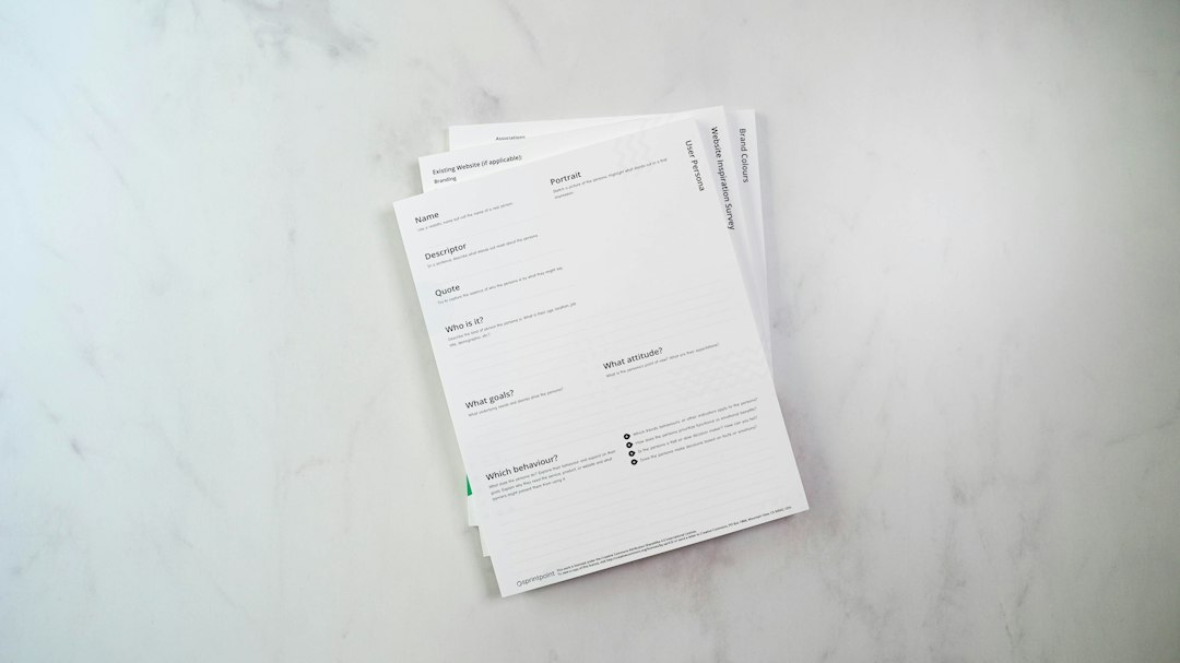
Step 4: Place Fields Like a Designer, Not a Technician
Professional field placement is about spacing, alignment, and reading flow. A form can be technically functional and still feel sloppy. Users notice when boxes are crooked or too small.
Follow these placement rules:
- Align fields to the labels: Keep fields on the same baseline as their labels when placed side by side.
- Use equal field widths: Fields in the same column should usually match in width.
- Respect margins: Do not place fields too close to the page edge.
- Match field height: Standard text fields should have the same height across the form.
- Group related fields: Keep city, state, and ZIP code together.
- Give signatures room: A signature field should not feel squeezed into a corner.
Use your editor’s alignment tools. Select several fields and align them left, right, top, or bottom. Then distribute spacing evenly. This takes seconds and makes the form look far more professional.
Step 5: Set Field Properties
Field properties control how the form behaves. This is where you prevent bad data and reduce user errors.
Check these settings:
- Required fields: Mark key fields as required, such as name, email, date, and signature.
- Character limits: Set limits for fields like phone numbers or employee IDs.
- Font size: Use auto-size with care. Very long entries can shrink until they look tiny.
- Tooltips: Add short hints, such as “Enter date as MM/DD/YYYY.”
- Default values: Use only when they save time and will not confuse users.
- Validation: Use email, number, or date validation if your editor supports it.
For checkboxes and radio buttons, place each clickable square close to its label. Users should not wonder whether a box belongs to the option above or below it.
Step 6: Fix the Tab Order
Tab order is easy to forget. It is also one of the fastest ways to spot an amateur form.
When a user presses the Tab key, the cursor should move in a logical order: top to bottom, left to right. If it jumps from “First Name” to “Signature” and then back to “Address,” users will get irritated.
Open the tab order panel in your PDF editor and reorder fields manually if needed. Test it by filling the form without touching the mouse. If you can complete the form smoothly with the keyboard, you are on the right track.
Step 7: Test the Form Before Sending It
Save a test copy and fill it out as if you were the recipient. Use a realistic name, a long email address, a full street address, and a signature. Try to break the form a little. That is the point.
Check for these issues:
- Text that gets cut off
- Fields that overlap labels
- Required fields that are missing
- Radio buttons that allow multiple answers by mistake
- Dropdown menus with unclear choices
- Signature fields that do not work in common PDF readers
- Tab order problems
Also test the form in a free PDF reader, not only in the editor used to create it. Many recipients will open it in basic software. Some may use a browser preview, which can behave differently.

Common Mistakes to Avoid
The most common mistake is building the PDF form from a Word file that was never designed as a form. The second is trusting automatic recognition too much. The third is forgetting mobile users.
Keep fields large enough for touchscreens. Avoid tiny checkboxes. Use clear section headings. Split long forms into sections such as Personal Information, Employment Details, Payment Information, and Authorization.
If a form has more than 60 fields, add visual breathing room. Dense forms feel harder, even when they ask simple questions. A little spacing can reduce mistakes and make the document feel less like tax season.
Final Checklist for a Professional Fillable PDF
- The Word file uses clean spacing and stable layout.
- The PDF export matches the original document.
- Each field type fits the question being asked.
- Text boxes, checkboxes, and signatures are aligned.
- Required fields are marked correctly.
- Field names are clear and useful.
- Tab order follows the reading order.
- The form works in common PDF readers.
- A test user can complete it without asking questions.
A fillable PDF should feel simple, even when the document behind it is complex. Start with a clean Word file. Add fields with care. Test every path. That extra polish saves time for everyone who touches the form.